品牌識別設計
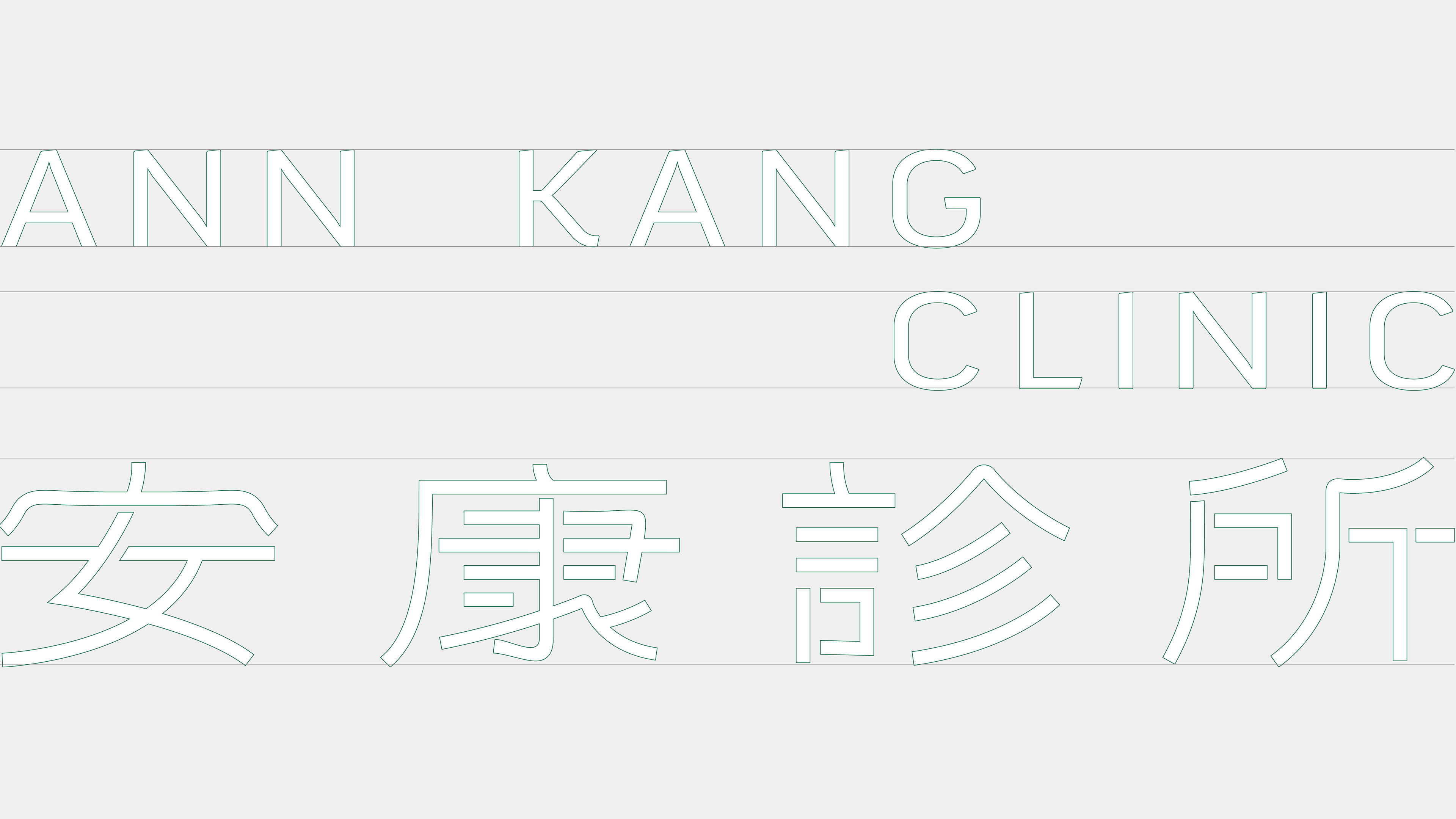
ANN KANG CLINIC
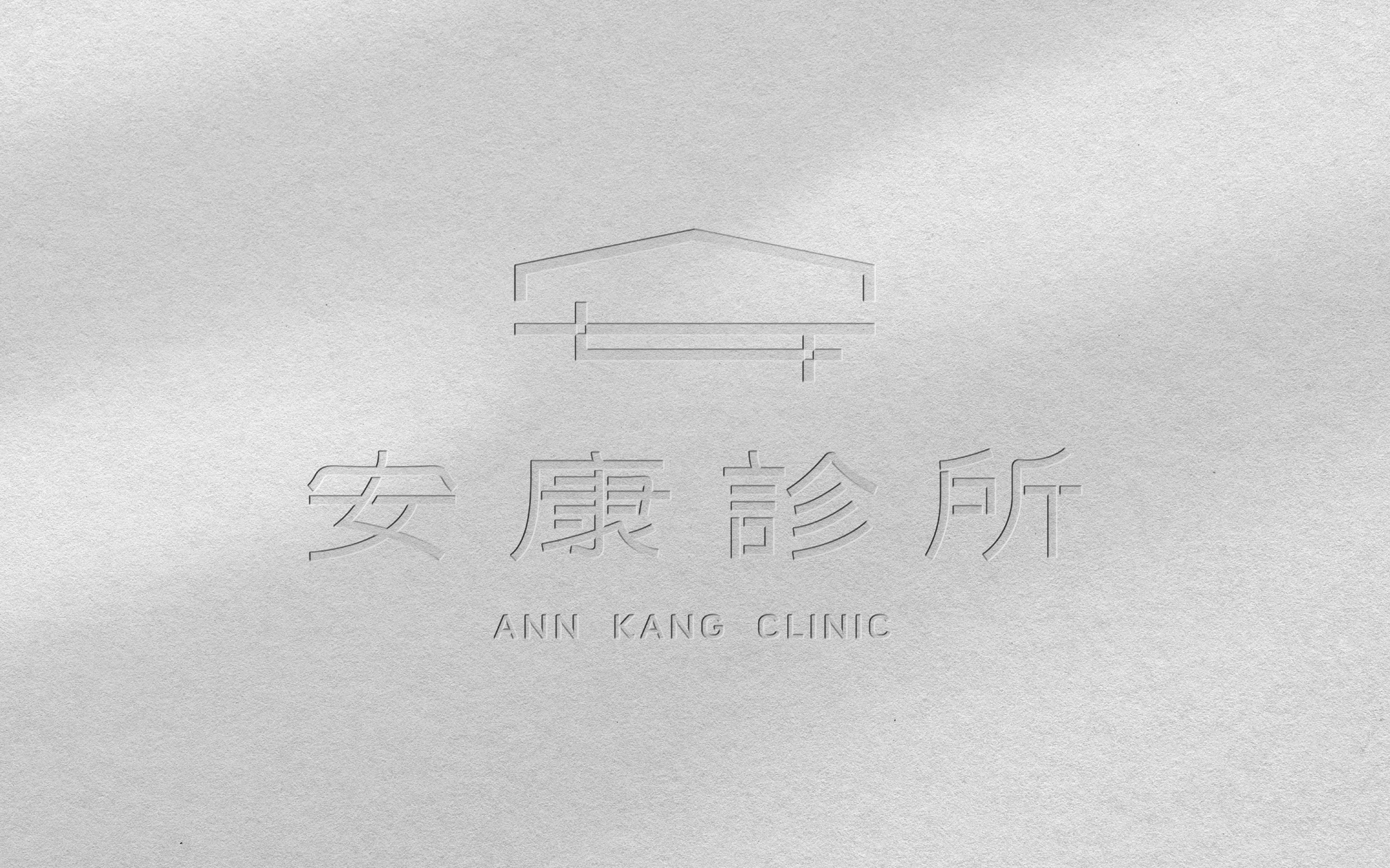
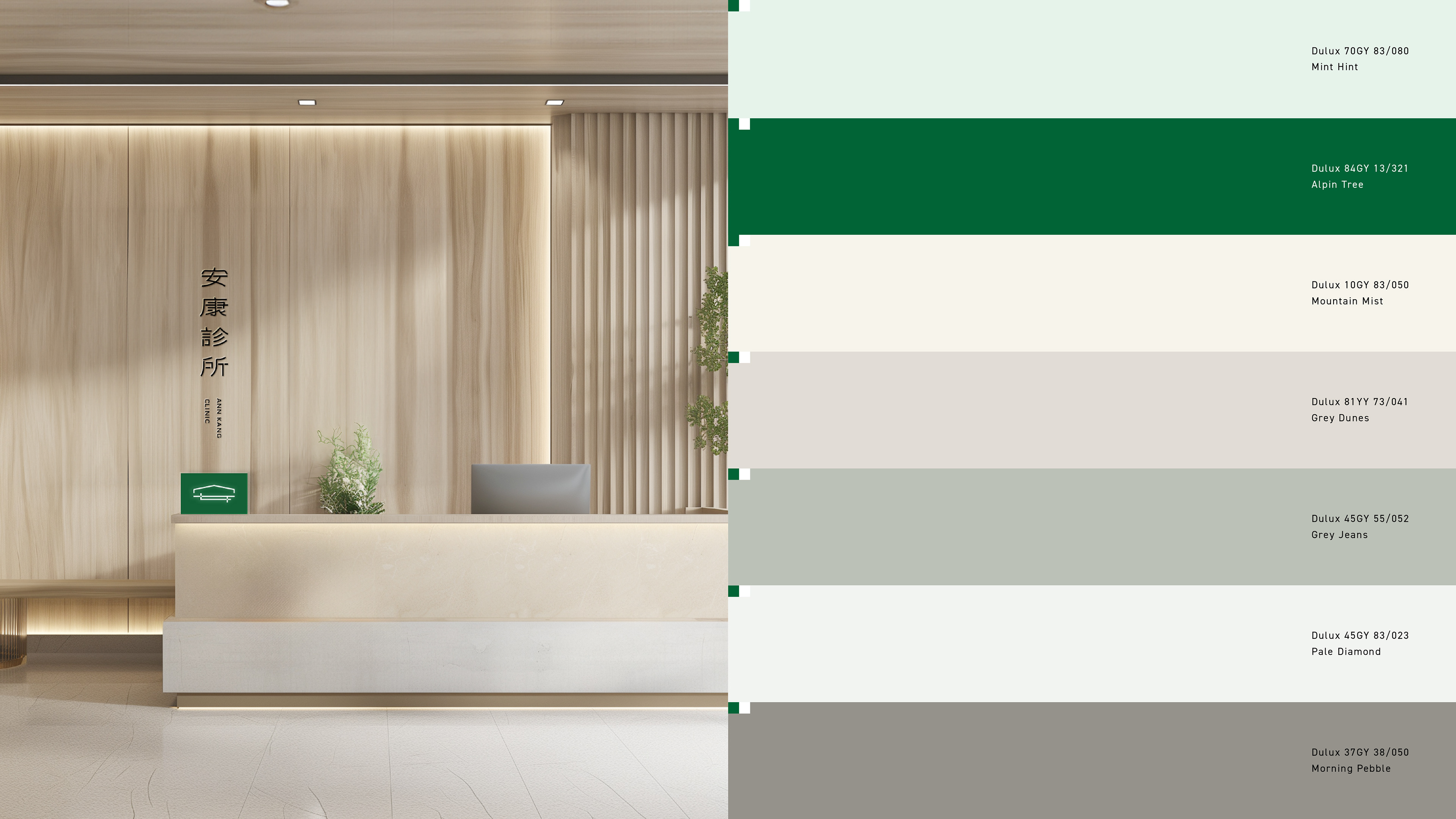
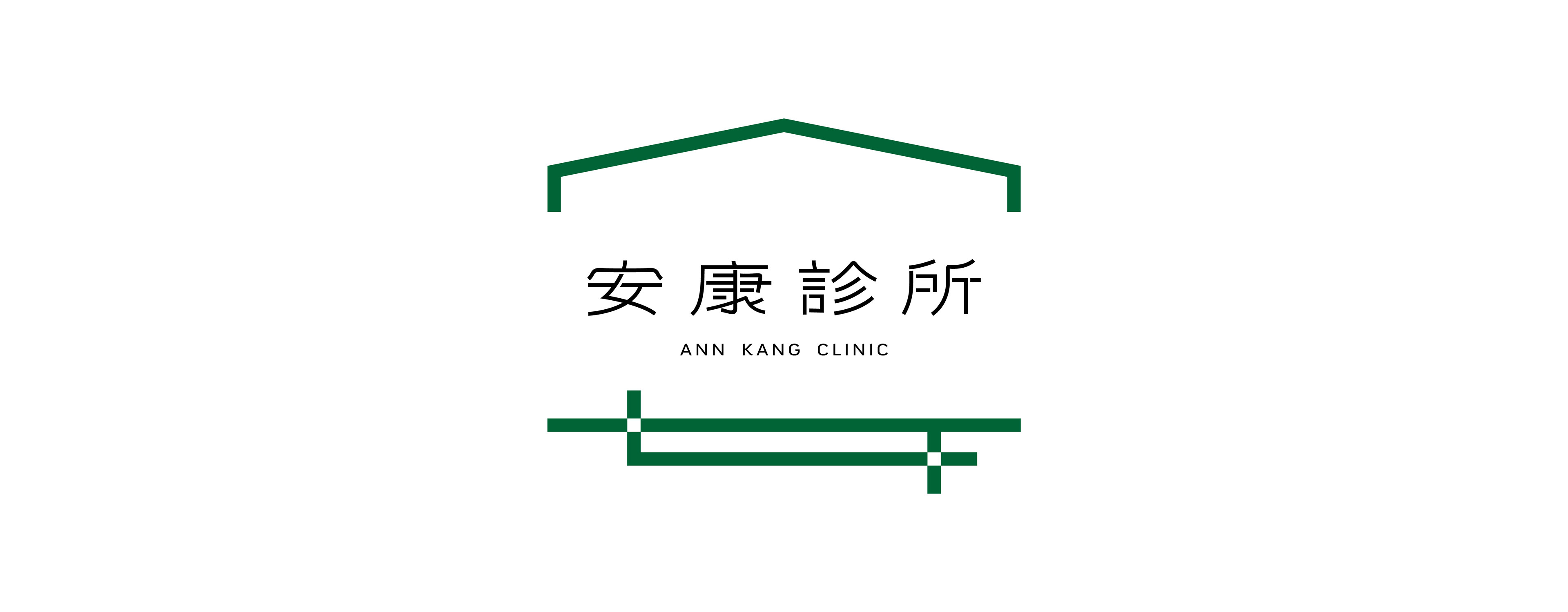
安康診所
ANN KANG CLINIC
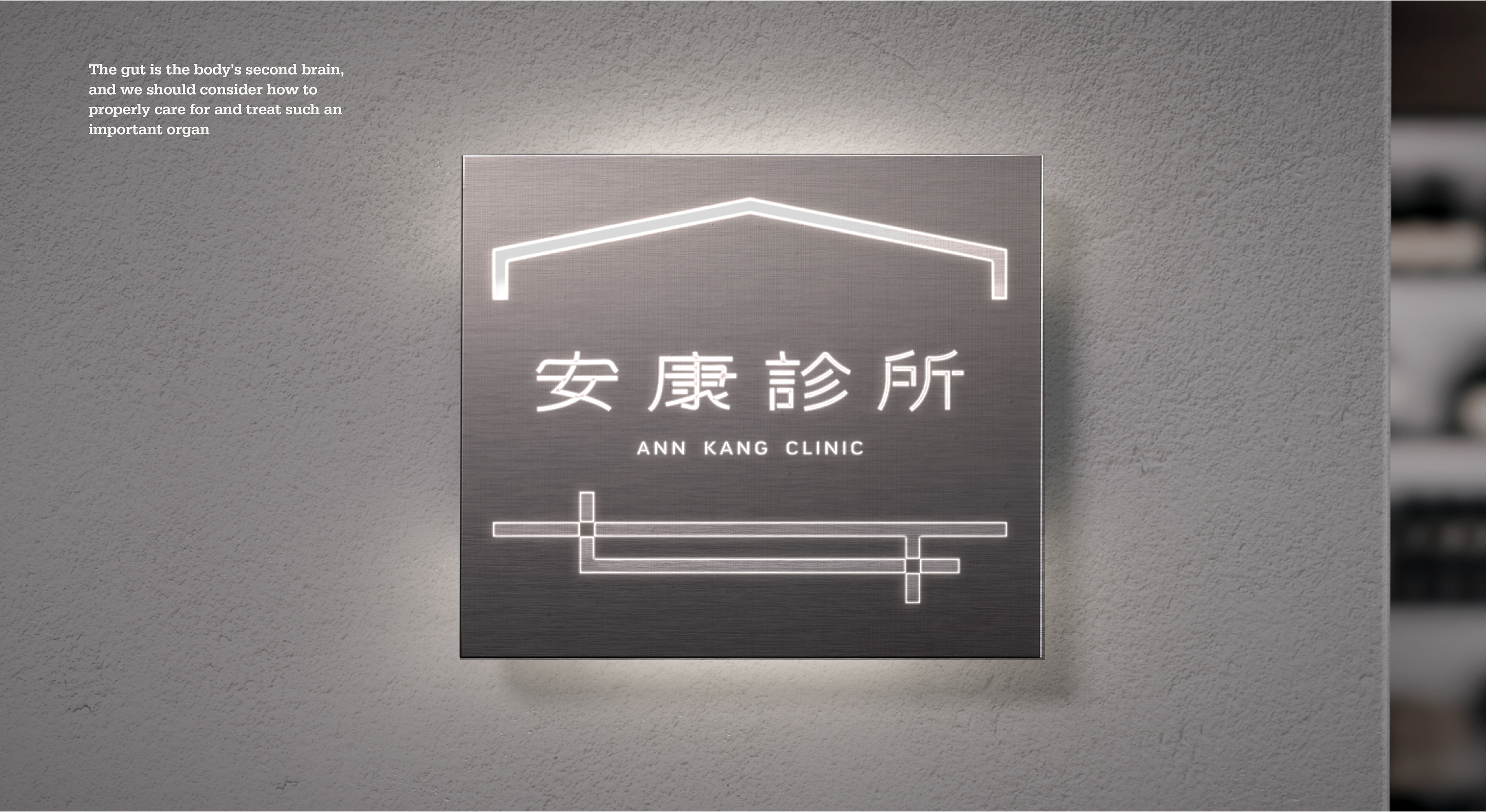
安康診所
「安康,陪你一直安穩健康」
專注於提供專業、細心的腸胃健康管理服務,致力於成為您持久健康的守護者。我們相信腸胃健康是整體幸福的基礎,因此以全方位的診療服務,從預防、治療到日常保養,為患者提供長期支持。透過「安康,陪你一直安穩健康」的理念,專業醫療技術與溫暖陪伴的結合,讓每位患者感受到安全、穩定的健康守護,享受安心無憂的生活品質。
設計方案
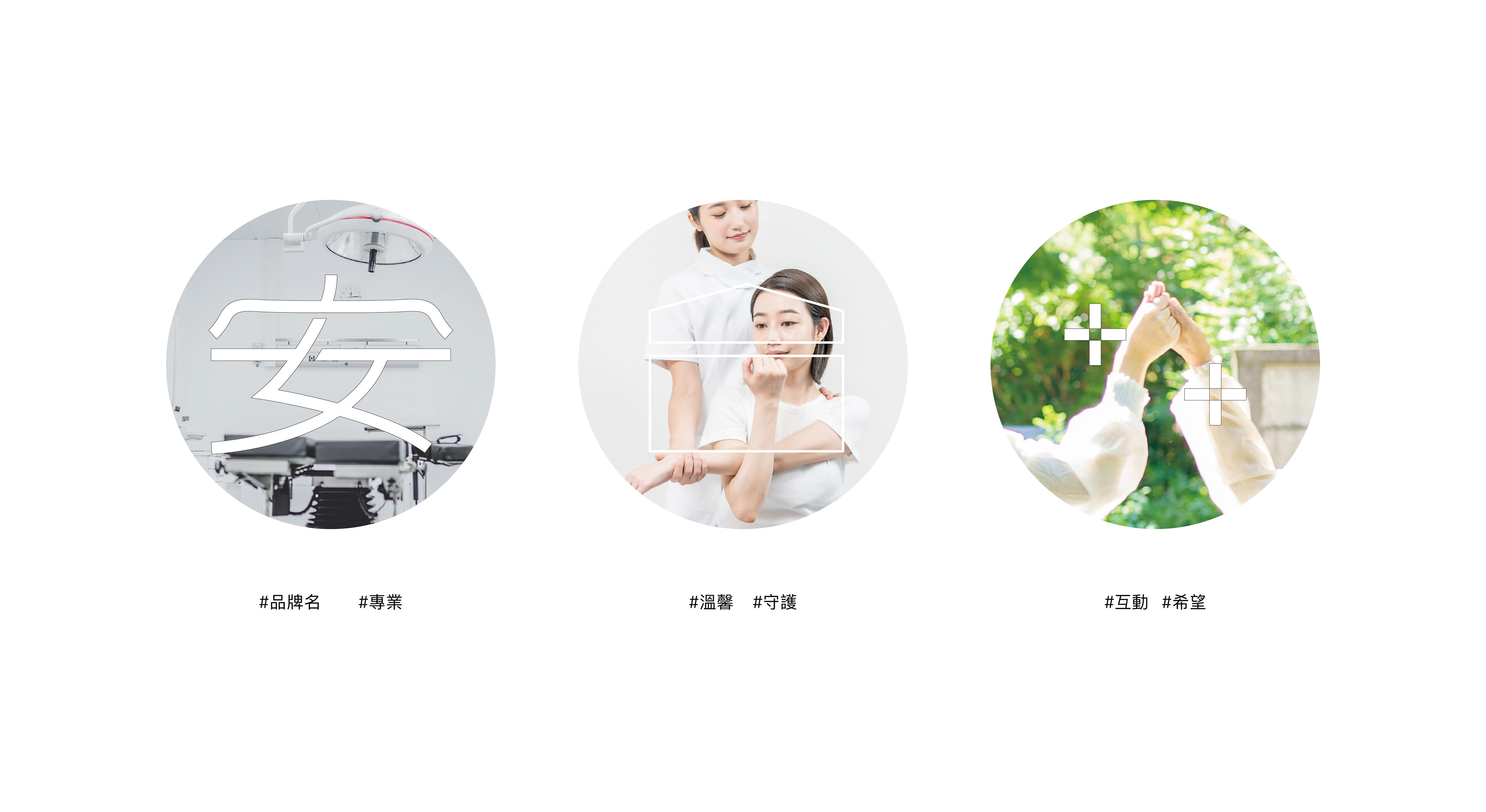
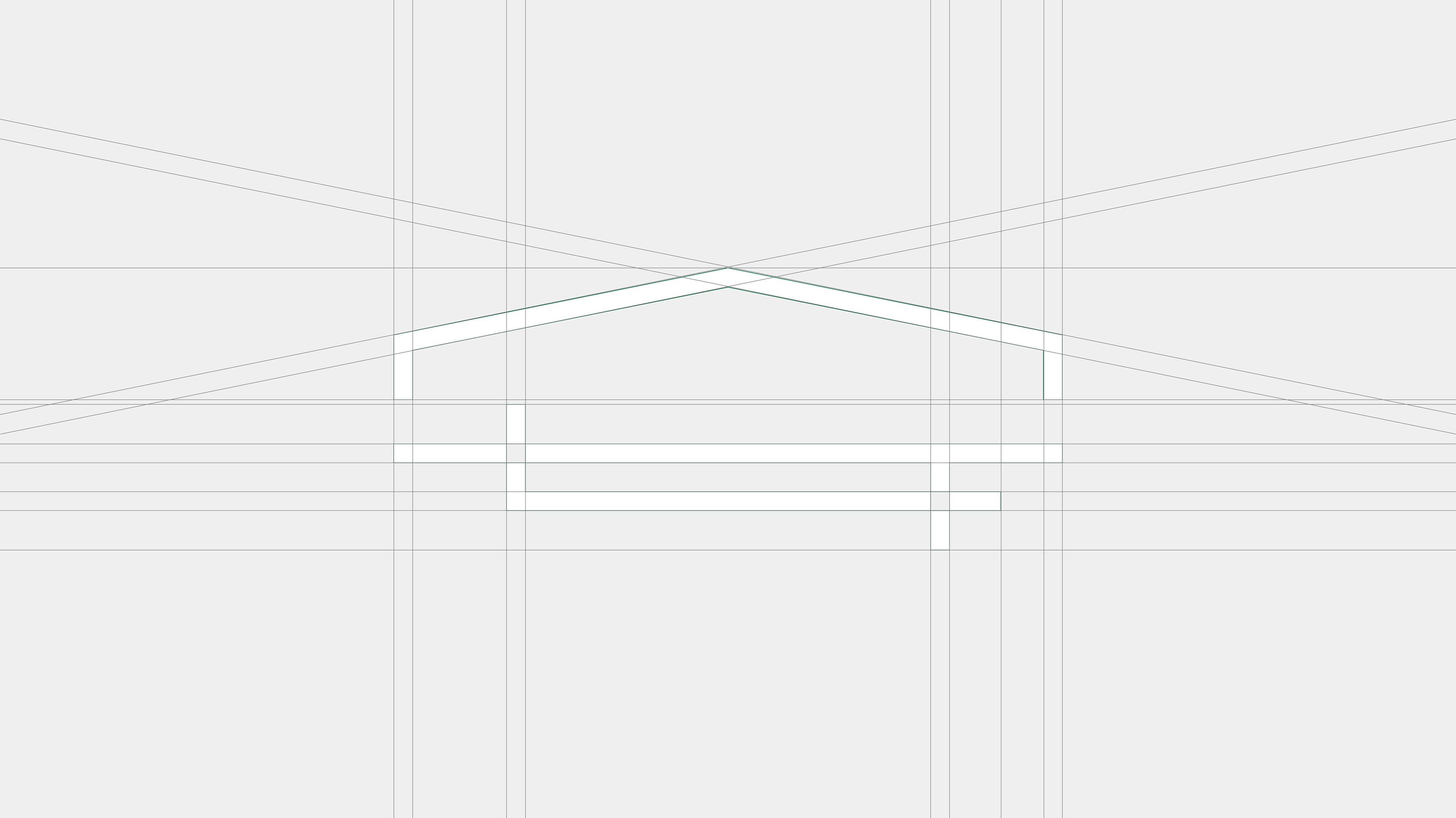
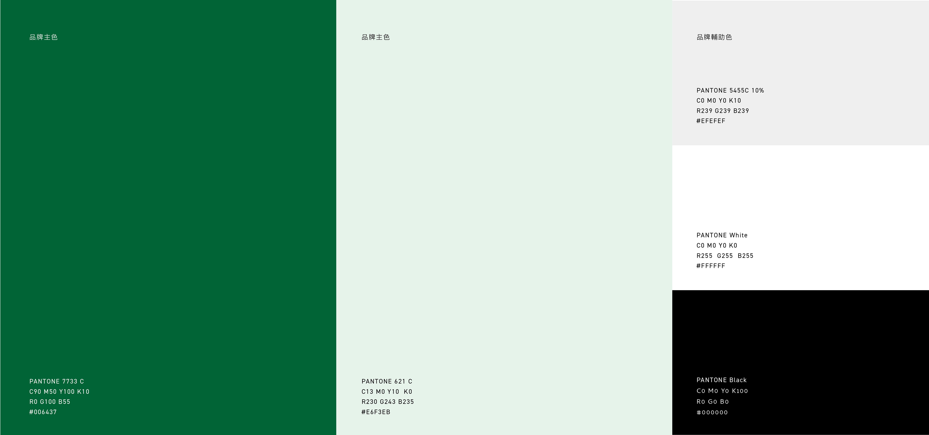
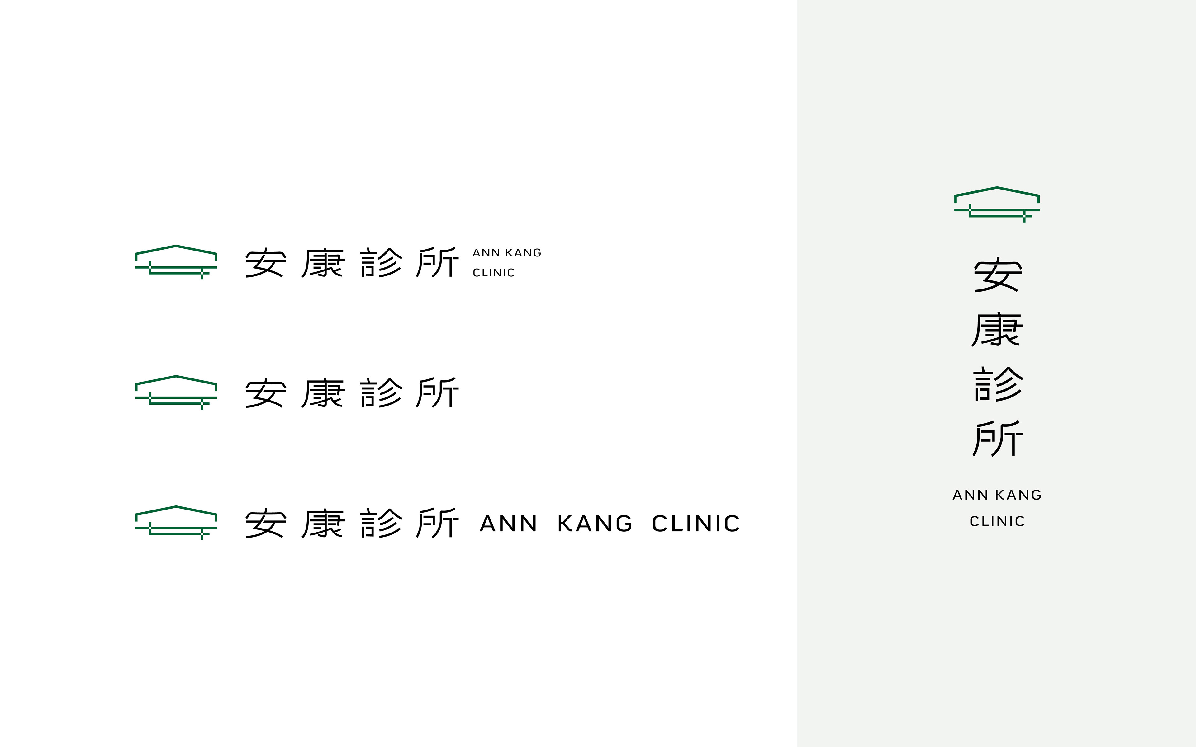
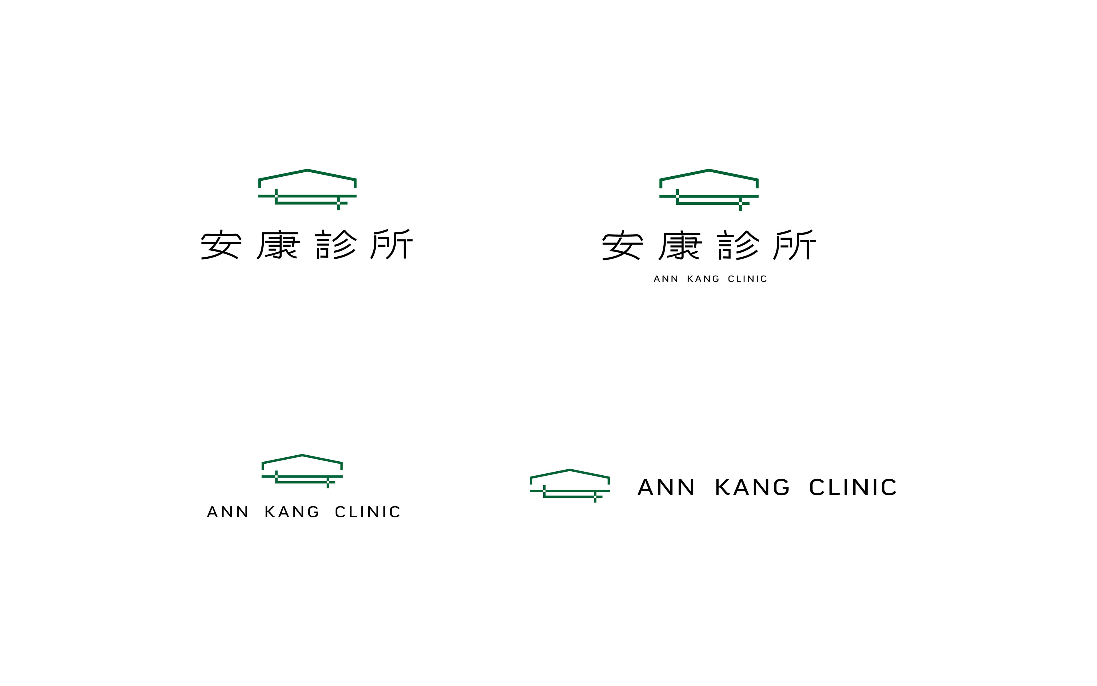
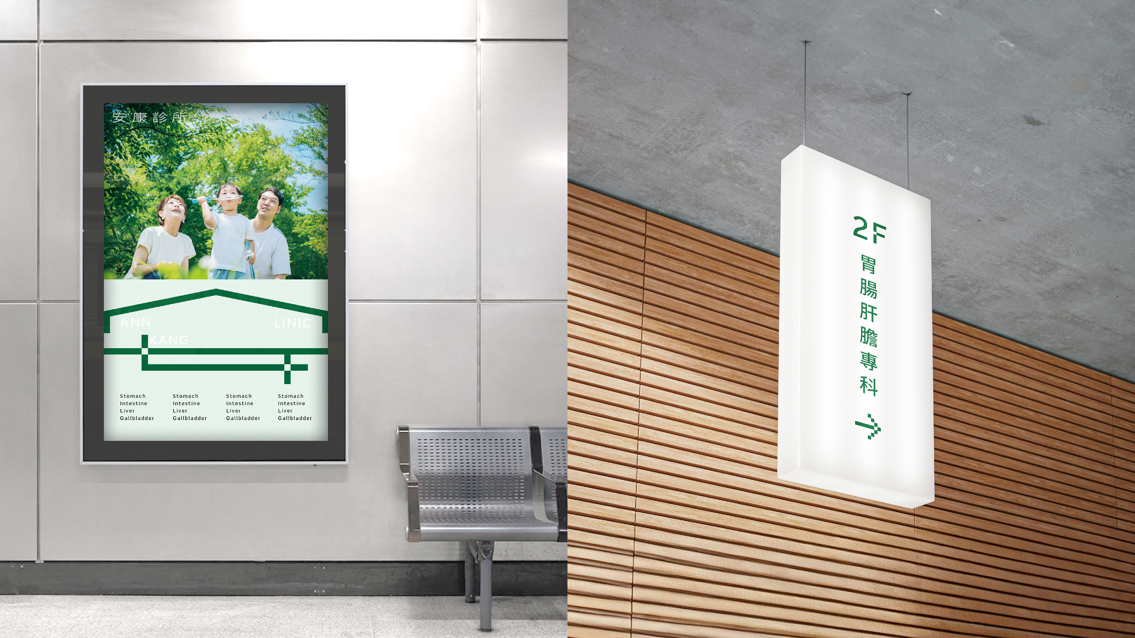
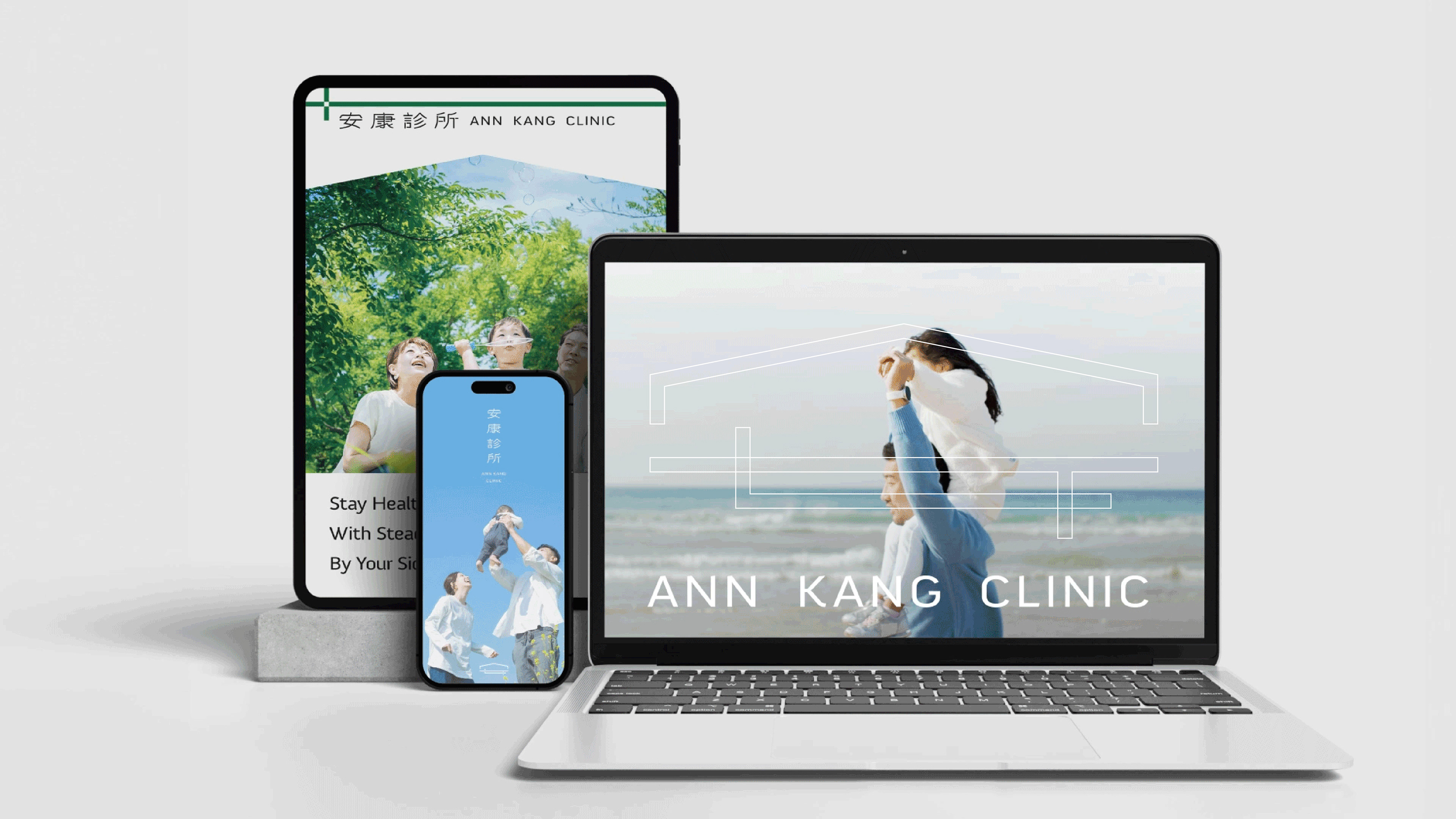
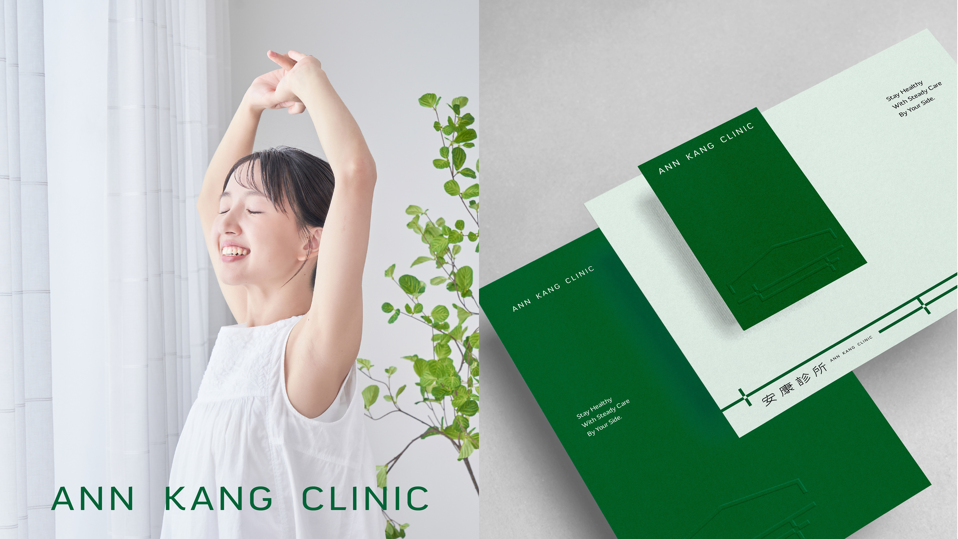
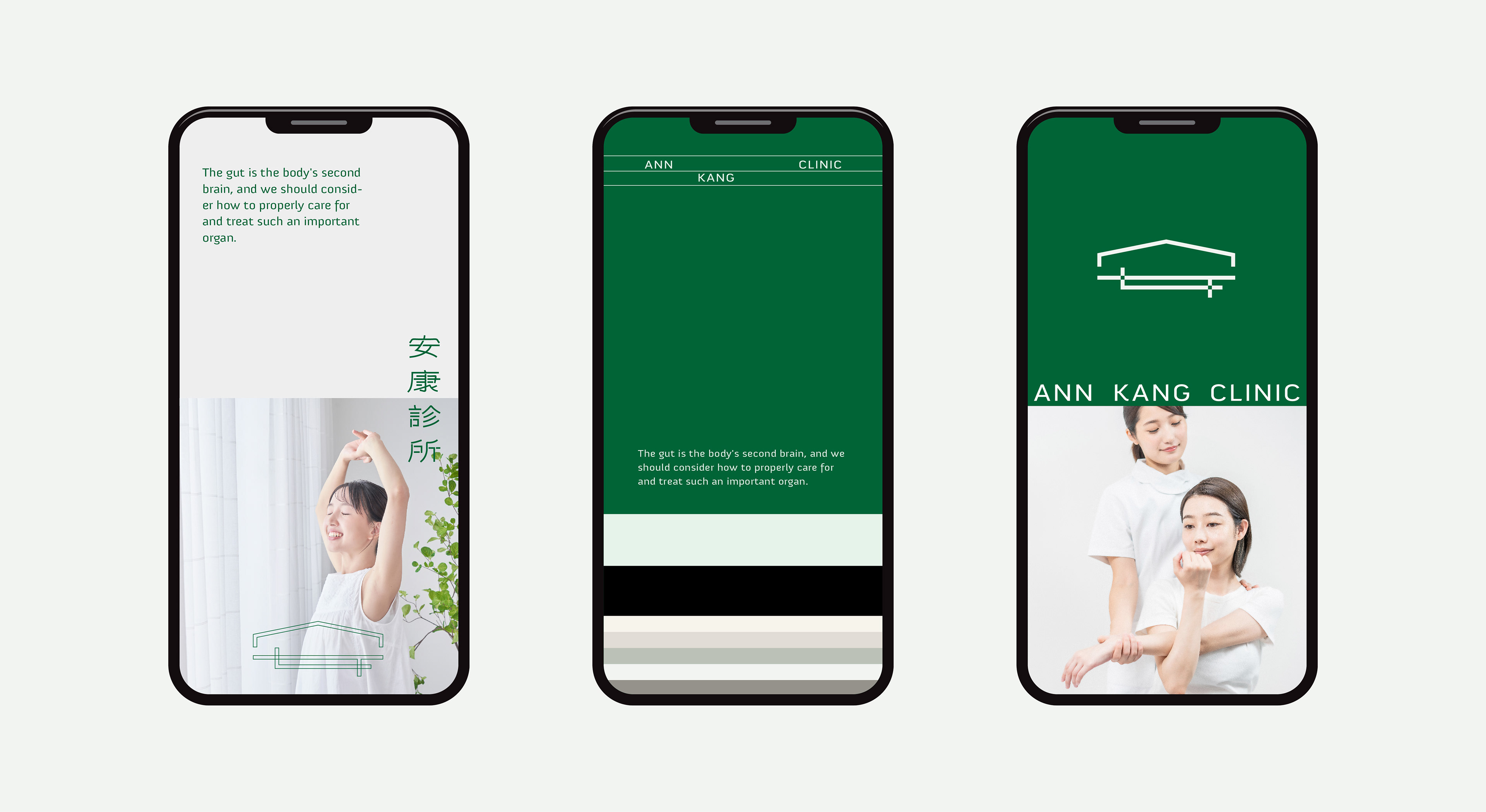
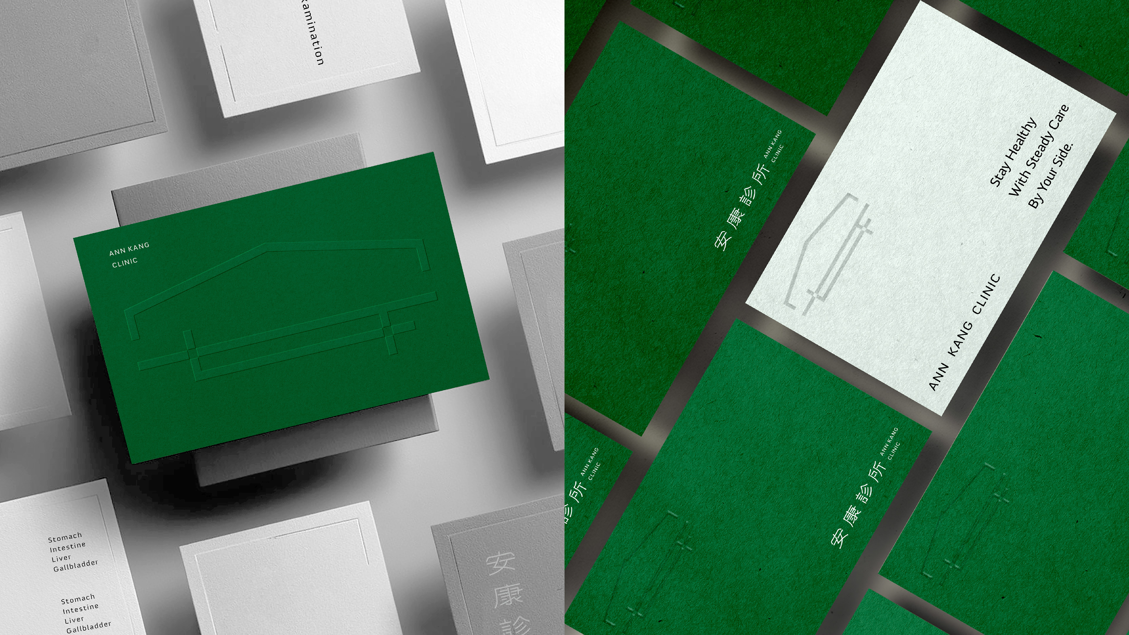
視覺識別設計理念基於簡約與穩定性,以安字為主體,透過乾淨的線條與結構化的元素傳遞這些特質。綠色調象徵健康、更新與平衡,強調診所對健康與腸胃護理的專注。極簡的房屋形象喚起保護與溫馨感,象徵診所提供穩定且持續的健康照護服務。整體設計與診所的使命一致,強調長期的健康守護與安心的醫療環境。
The visual identity of 安康診所 (Ann Kang Clinic) is grounded in simplicity and stability, as conveyed by the clean lines and structured elements in the logo. The green tones evoke a sense of health, renewal, and balance, reinforcing the clinic's focus on wellness and gastrointestinal care. The minimalistic house-like symbol suggests a protective and welcoming environment, emphasizing the clinic’s commitment to providing stable and continuous healthcare for its patients. The design aligns with the clinic's mission of offering dependable, comforting care for long-term well-being.
Client - 安康診所
Year - 2024
Creative Director - 蘇昱安 Ian Su
Designer - 袁書涵 Shu Han Yuan / 胡復容 Fu Jung Hu / 林秝圻 Lizzy Lin