網站設計
bitebitefruit
咬咬果
bitebitefruit
咬咬果
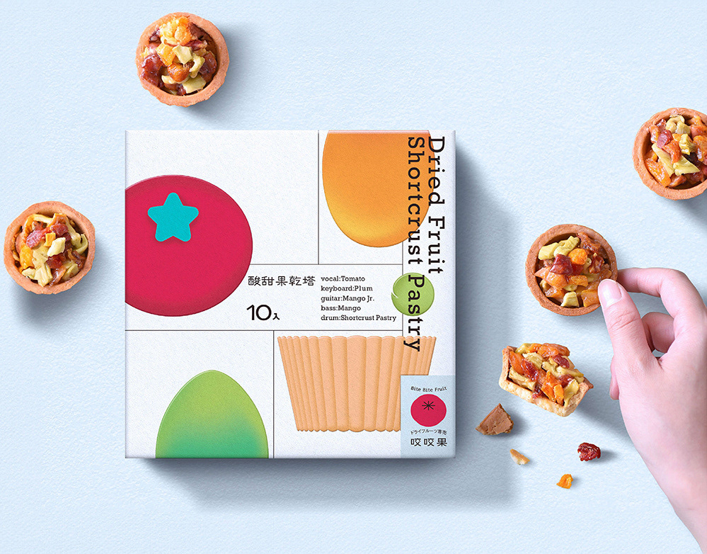
整體網站設計以柔和的暖色系為基底,結合品牌象徵的紅色色調,營造溫暖且充滿活力的氛圍。主視覺採用清新明亮的商品照為主角,讓產品細節一目了然,並引導消費者專注於核心資訊。同時,米白與柔和暖色調的搭配提升視覺舒適感,使每一次的瀏覽體驗如同與品牌的親密互動,輕鬆愉悅。
透過直觀的資訊呈現與精簡的操作設計,網站不僅展現產品的魅力,更貼心地為使用者提供流暢、友好的購物旅程,讓品牌精神在每一個細節中得以延伸。
The overall website design embraces a soft and warm color palette, highlighted by the brand's signature red tones to create a vibrant and welcoming atmosphere. With product imagery taking center stage, every detail is presented clearly, allowing users to focus effortlessly on essential information. The harmonious blend of off-white and warm hues enhances visual comfort, transforming every browsing experience into an intimate and delightful interaction with the brand.
By combining intuitive content presentation with streamlined navigation, the website not only showcases the allure of the products but also ensures a seamless and user-friendly shopping journey. Every detail reflects the brand’s commitment to extending its essence across the digital experience.


Client - 咬咬果
Year - 2024
Creative Director - 蘇昱安 Ian Su
Designer - 袁書涵 Shu Han Yuan / 歐子豪 Ozi Hao